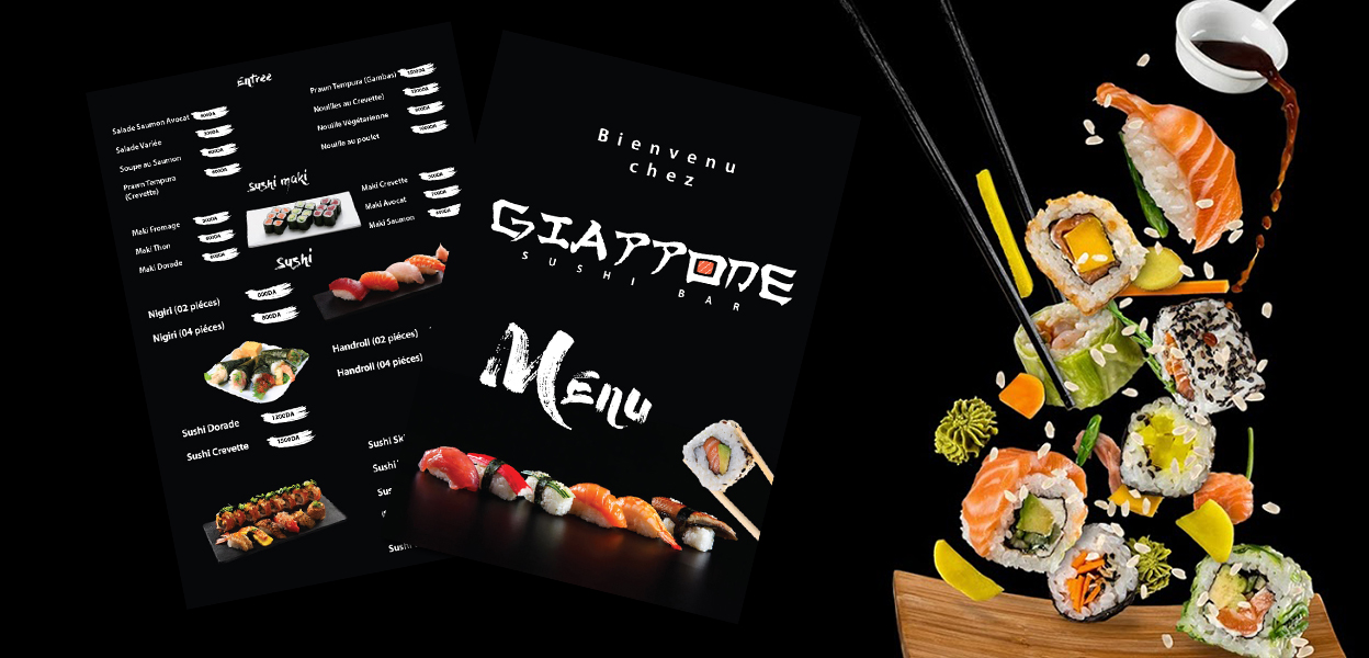
Newly established Japanese cuisine resturant specialized in sushi nedded a strong brand that would fit their 10 years old experience in japanese cuisine and traditional japanese yet luxurious establishment.
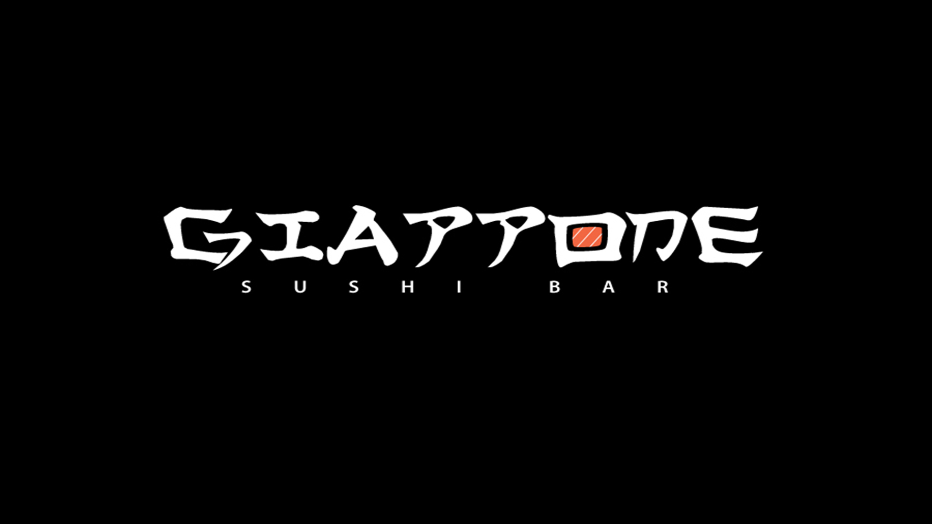
The idea to use japanese style writing to create a word mark logo came late in teh design process yet it fell right into it place, as it gave the word mark and authentic japanese style yet readable to western audiance.

To emphesise sushi speciality we had to came up with a symble that would fit within the word mark, and the letter O turned to a nigri roll slice was best fit to maintain the logo readable yet make the sushi roll clear and visible at same time, to end up having a word mark that is both simple yet identify clearly the establishement.