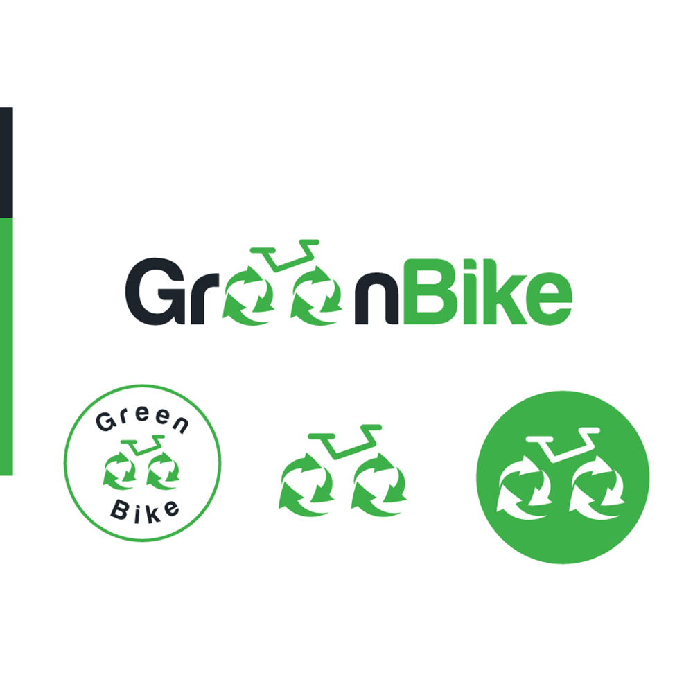
The Biggest challenge was to recreate a new engaging simple and easy to identify at first sight brand while maintaining the same messages of the old one
A strong eye catching green color was used to both attract attention and emphesise the environmental role of the organization in collaboration of the recycle bike emblem , teh messages were pretty clear
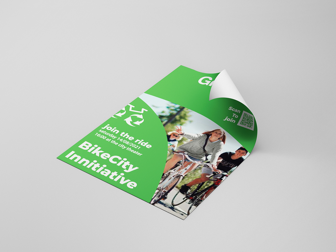
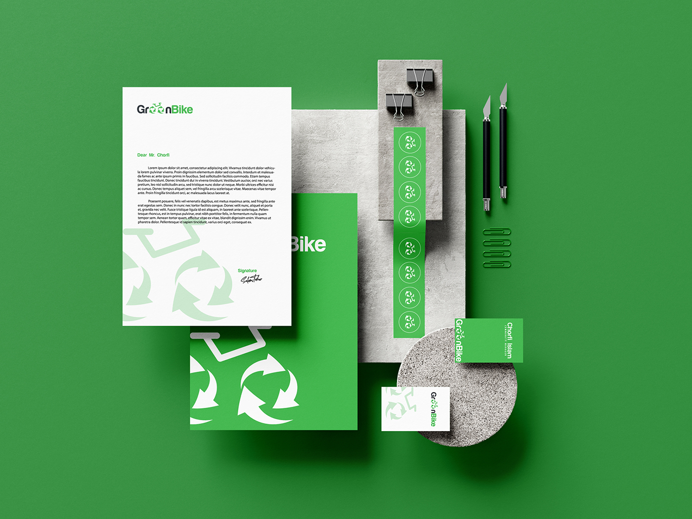
Digipen studios team focused on a simple green and white flat design for all Print materials to achieve an eye catching effect and emprint the green and white pattern in the community that would always relate to Greenbike