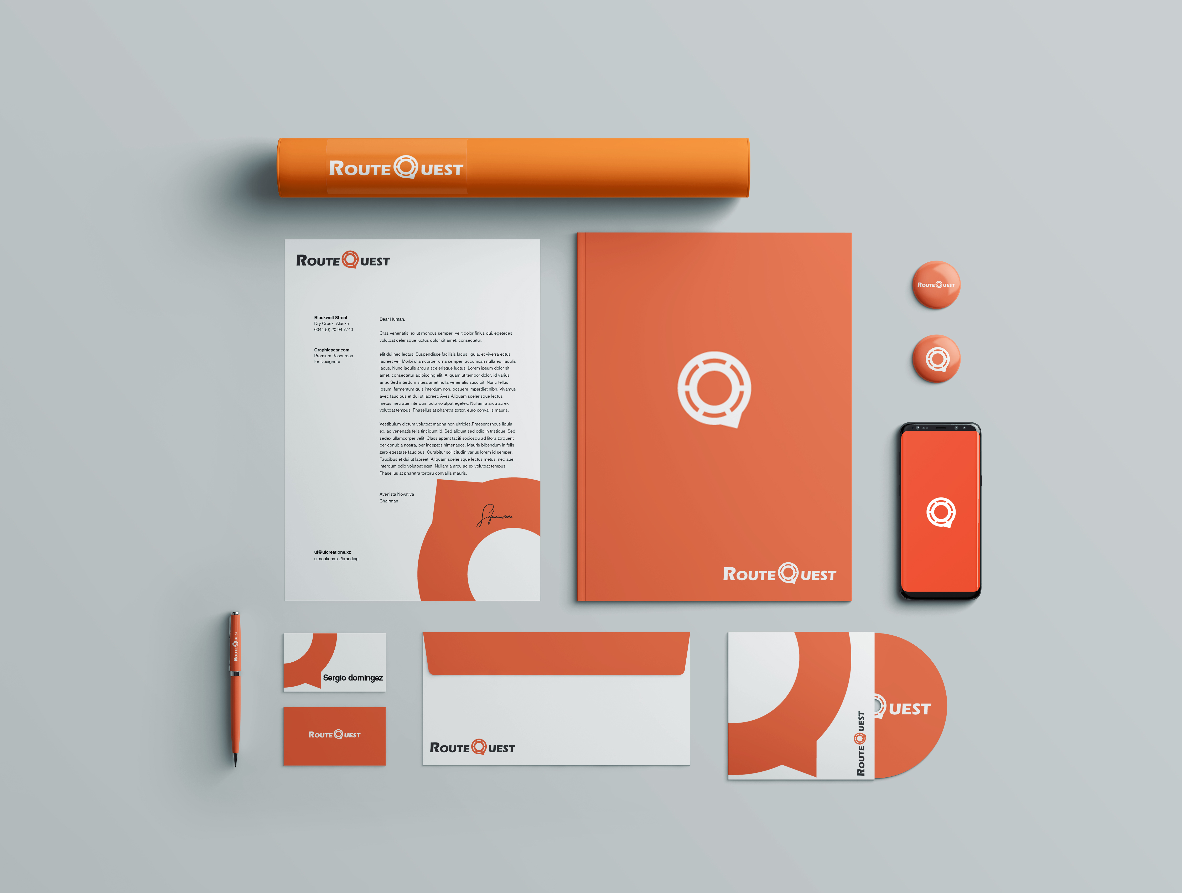
The team behind routequest was in search for a brand simple enough yet strong to mark and easily identify their app in the app store

The brand was needed to be built around a simple symbole ,a futur icon for the app. The Q letter was used to represent a round about, a place that can lead you in every direction you wish to go.


The color used was energetic, eye catchy ,meant for a young and outgoing audience .